
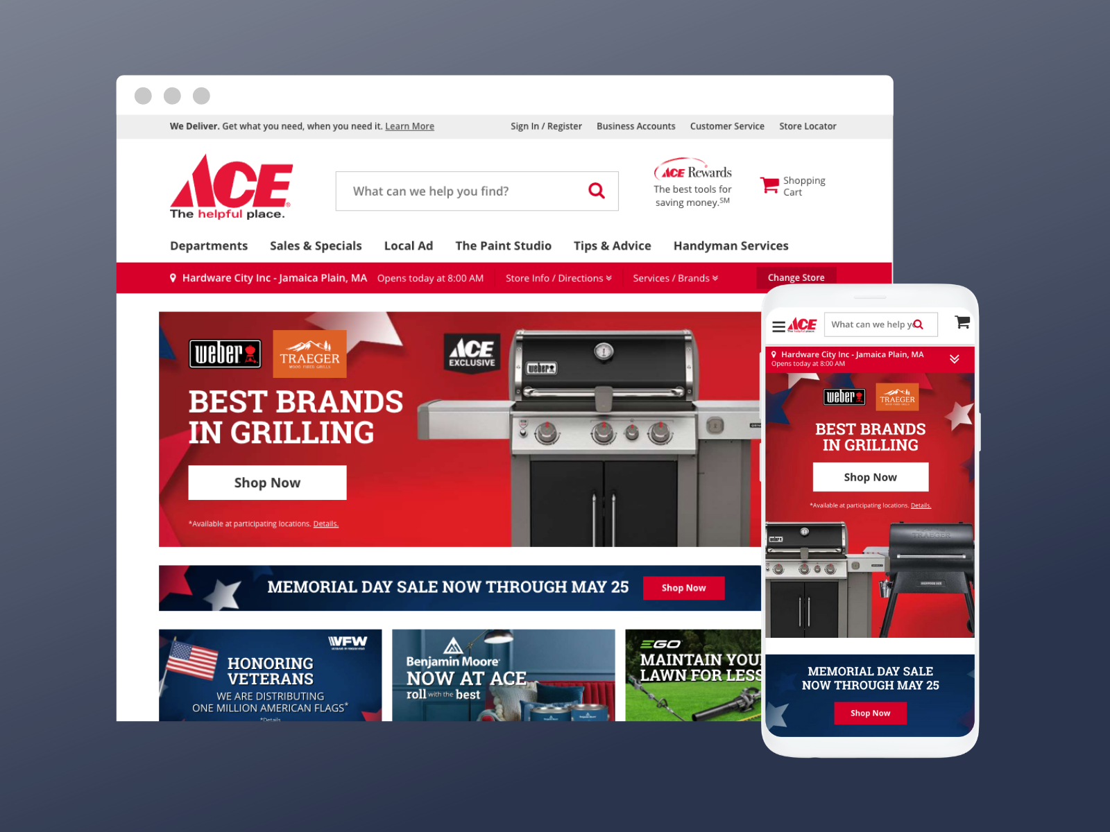
In 2019, Google performed a site audit of Ace Hardware’s website to find areas of improvement. The audit included current state findings regarding Ace’s user experience, site performance, performance culture, and tech stack. Google then relied on the Accenture Interactive Studio to assist with some of the updates & opportunities to improve Ace’s performance and customer retention.

Ace Hardware: Site Optimization
The Challenge
How can we partner with Google to create an optimal user experience for Ace Hardware’s current website?
My Role
Lead Experience Designer
For this project, I was tasked as the lead designer and worked closely with the Google Technical UX Team going over their audit and generating ideas to optimize and improve Ace’s website experience, especially on mobile devices. Some of the areas that required the most attention was how the website handled mobile search (results & no results), faceted search including filters & sorting, general form design, and Ace Rewards user flow. I designed several recommendations that received approval from both Google and Ace, and provided dev support to implement those recommendations.
Scope
- Website Design Recommendations & Improvements
Skills Executed
- UX/UI Design
- Mobile Design
- Website Design
- Site Auditing
Year
- 2019
Audit Findings
After Google’s Technical UX team conducted their initial audit of Ace’s website, they found that there were many areas of improvement that would optimize the user’s experience when engaging on their site. I also conducted an audit on the screens that Google pointed out, and we complied list a key findings that centered around site search, filtering & sorting, forms & form flows, and finally, accessibility.
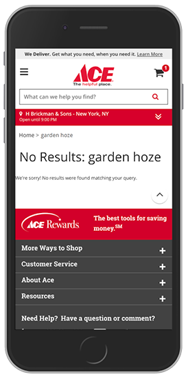
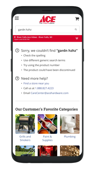
No Search Results
- Search field is empty when the page loads results. That means the user will have to retype “Garden Hose” instead of just changing the letter “z” to “s”.
- Does not predict that the user possibly misspelled the keywords for garden hoses, thus not showing results for said item.
- In the case the predictive system can not find the keyword(s), no helpful tips to improve search is displayed or who to contact in case the user needs further assistance.
- Can also display navigate to other areas of the site like sale items, featured categories, promote exclusive offers, recently viewed items, etc.
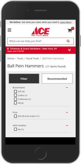
Filtering & Sorting
-
Large filter & sort buttons are providing this navigation too much prominence. Also not entirely clear that “Recommended” is a sort button.
-
Every type of refinement menu option is expanded instead of being collapsed, causing the page to become much longer.
-
Entire filter menu closes when user taps on one refinement, not allowing them to make multiple selections before applying the filters.
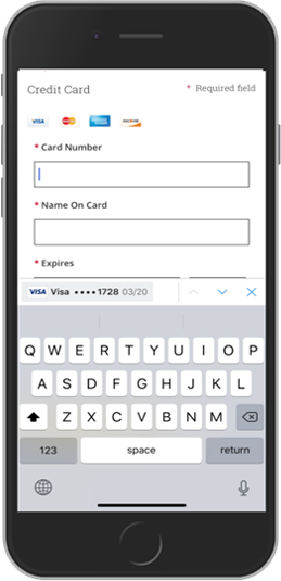
Forms & Form Flow
- When the user interacts with an input field that only requires numbers, number pad doesn’t appear as default keyboard.
- Some errors appear at the top, inline, or both. No real-time validation
- First and last Name fields recognizes numbers as valid
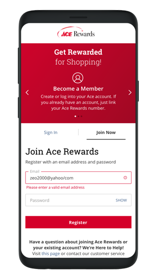
- Rewards sign-up process is confusing
Accessibility
-
Font sizes are too small for accessibility standards.
-
Currently the item description is difficult to read because it is center justified with no contrast since everything is a bold / semibold font weight. Also, the descriptions can run long into 4+ lines making the products grid appear uneven and add additional scrolling to see the next items underneath.
-
The star ratings on products are large giving them too much prominence. In addition, they could be misleading without a number count next to them.
My Recommendations
After the discovery process and coming up with findings from our audit, I produced a list of recommendations with high fidelity mock-ups to accompany them. I made my presentation deck and presented them to Google to see if my solutions adequately solved our findings and met their standards. Once I received their approval, I then presented the same recommendations to Ace Hardware. The client saw the value of the improvements and I started to work with the dev team to implement my designs.
No Search Results
-
Keywords remain in search field. This is helpful to edit specific characters instead of retyping entire keyword(s).
-
No results page will provide tips to improve their search.
-
The no results page will also provide contact information for additional assistance.
-
Departments that are frequently visited by Ace customers or that Ace would like to prioritize.
-
An opportunity for Ace to display items for sale, clearance and online deals.
-
Display all departments so the user can navigate their way to the product they were looking for.
-
Remind users of items they have previously viewed, but didn’t add to the cart. This can be an opportunity to avoid a lost sale or customer.
Fuzzy Search Page
-
Fuzzy search functionality predictively determined that the user mistyped “Garden Hoze” for “Garden Hose”. Displays how many products were predictively found for the searched item. Also provides a link to search for the misspelled word in case the user feels the system incorrectly predicted their keyword(s).
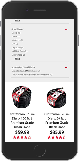
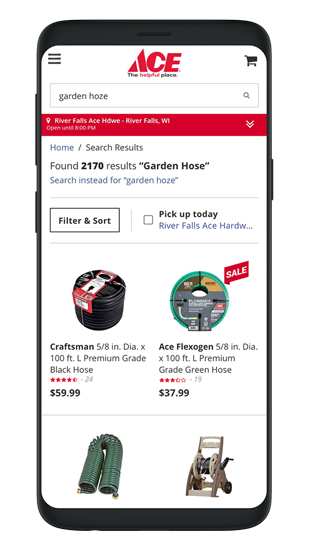
Product Listings
-
Product description is left justified and brand name is bold to provide contrast and legibility. Also, description is limited to only three lines; This helps the grid of items to look more aligned and cuts down on page scrolling.
-
Stars are smaller and supplemented with a ratings count. This is helpful for items that might have no stars shaded putting away assumptions that the product was less than desired by customers when it could be that no one rated it yet.
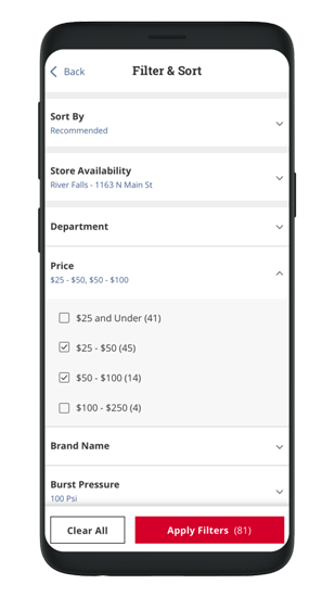
Filter Menu
-
Filter menu is now a full screen experience over-top the results. User can perform all the refinements they like and apply them without the screen refreshing.
-
Sorting refinement option is included in the filter menu.
-
Added a refinement to view products the user can go pick up at the nearest Ace Hardware store.
-
Accordion style navigation expands when the user taps on a specific filter.
-
Because of the accordion navigation, menu options are more compact which fits more content on the screen.
-
Filter option selected is displayed on second line.
-
Bottom navigation is sticky to the bottom of the screen, and also displays a count of how many items match their selections.
- Font size is more legible and buttons are large enough to tap.
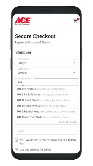
No Search Results
-
Redesigned input field to provide differentiation from secondary button design.
- Location entry made easy with Google Places API to autofill street address, city, state, and zip code.
Accessibility
- Real-time validation with either check-marks for valid entry and red outline helper text with alert icon for invalid entries.
- Placeholder text animates to a floating label when field is tapped into, thus saving screen space.
